I have been wanting to learn to use pyplot, but haven’t found the time. Last week I was inspired by Seth Brown’s post from last year on command line analytics, and I decided to make a graph of my most common commands.
I began using zshell on my home Mac about six months ago, and I have 15,000 lines of history since then:
$ wc -l ~/.zsh_history
   15273 /Users/grigg/.zsh_history
(Note it is also possible to get unlimited history in bash.)
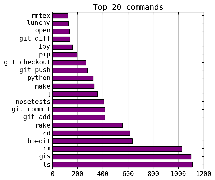
I compiled a list of my top commands and made a bar chart using pyplot. Since git is never used by itself, I separated out the git subcommands. Here are the results:
A couple of these are aliases: gis for git status and ipy for ipython.
The lunchy command is a launchctl wrapper, j is part of autojump,
and rmtex removes Latex log files.
Clearly, it is time to use bb as an alias for bbedit.
I already have gic and gia set up as aliases for git commit and
git add, but I need to use them more often.
The first step is parsing the history file. I won’t go into details, but I used Python and the Counter class, which takes a list and returns a dictionary-like object whose values are the frequency of each list item. After creating a list of commands, you count them like this:
from collections import Counter
top_commands = Counter(commands).most_common(20)
To make the bar chart, I mostly just copied the pyplot demo from the documentation. Here is what I did.
|
|
I still find pyplot pretty confusing. There are several ways to accomplish everything. Sometimes you use module functions and sometimes you create objects. Lots of functions return data that you just throw away. But it works!