With all the hype that has been going on with the population of the world passing 7 billion people (sample headlines: “Cheers and fears as world population hits 7 billion” and “7 billionth baby: Congratulations are mixed with dire words”), I can’t help but add a little math to the conversation to make things interesting (and meaningful).
Before we talk math, you should know that part of why I care about this is that I take issue with the Malthusian prophecies and general spreading of fear. Many people believe if we don’t take drastic action (on population growth) soon, the fragile planet will collapse under the weight of its huge population. I think this is false, but also misguided. If we are worried about the planet’s resources—and I think we should be—we should be concentrating on limiting our aggregate effect on the environment, insetad of assuming that a smaller population will fix all (or any) of our problems.
Population growth is exponential. It always has been and always will be. But “exponential” does not mean “huge”. It means that the change in population (number of births minus number of deaths) is a multiple of the current population. This is why we usually talk about population growth in terms of percentages instead of absolute growth.
Of course, when we see a big round number like 7 billion, the percentage talk goes out the window and we start comparing how long it took the world to reach each successive big round number. Did you know that population increased from 6 to 7 billion in less time that it increased from 4 to 5 billion? Therefore population is growing faster now than it was in the 60’s, right?
If we were talking about the number of tater tots produced in a factory, then adding a billion to 4 billion to get 5 billion is exactly the same as adding a billion to 6 billion to get 7 billion. But people aren’t produced by machines. We are the machines. So even though birth rates are lower today than in the 60’s, the population is growing faster. In other words, adding a billion to 4 billion (25%) is harder than adding a billion to 6 billion (17%).
Mathematicians would say that in the realm of exponential growth, 6 and 7 billion are closer together than 4 and 5 billion are. Then they would write down some formulas and theorems to indicate exactly what they mean by “closer together”. At the end of the process, you’d get what we call a log graph. This is just like any other graph, except we stretch out the y-axis (by applying the log function) to reflect our new understanding of distance. Here’s what you get.
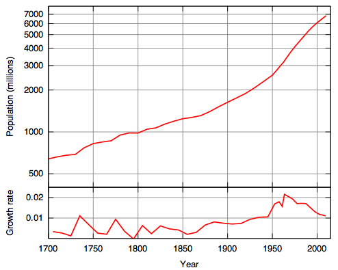
The graph on the bottom is the growth rate of the population. You see here that population growth peaked in the 60’s and has been decreasing since. You can see this in the population graph as an inflection point, where the graph starts to level out. In fact, the UN predicts that before the end of this century, the graph will hit its maximum (of about 10 billion) and then start to decrease slightly, finally stabilizing at about 9 billion. Of course, this is just an extrapolation of past trends, and no one knows how accurate these predictions will be.
The point I’m trying to make, though, is that it is hard to see these trends by looking at the population graph you usually see. Looking at those graphs, you would say that anyone who believes that world population is “leveling off” is way off track.
It is the people that treat population growth as a giant odometer that are not seeing things clearly.
The graph uses numbers from the U.S. Census Bureau and HYDE, from this wikipedia page. Also, tater tots were invented by my uncle.